Tuesday, 5 April 2011
Wednesday, 30 March 2011


Sunday, 27 March 2011
Saturday, 26 March 2011
EVALUATION Q4- Who would be the audience for your media product?
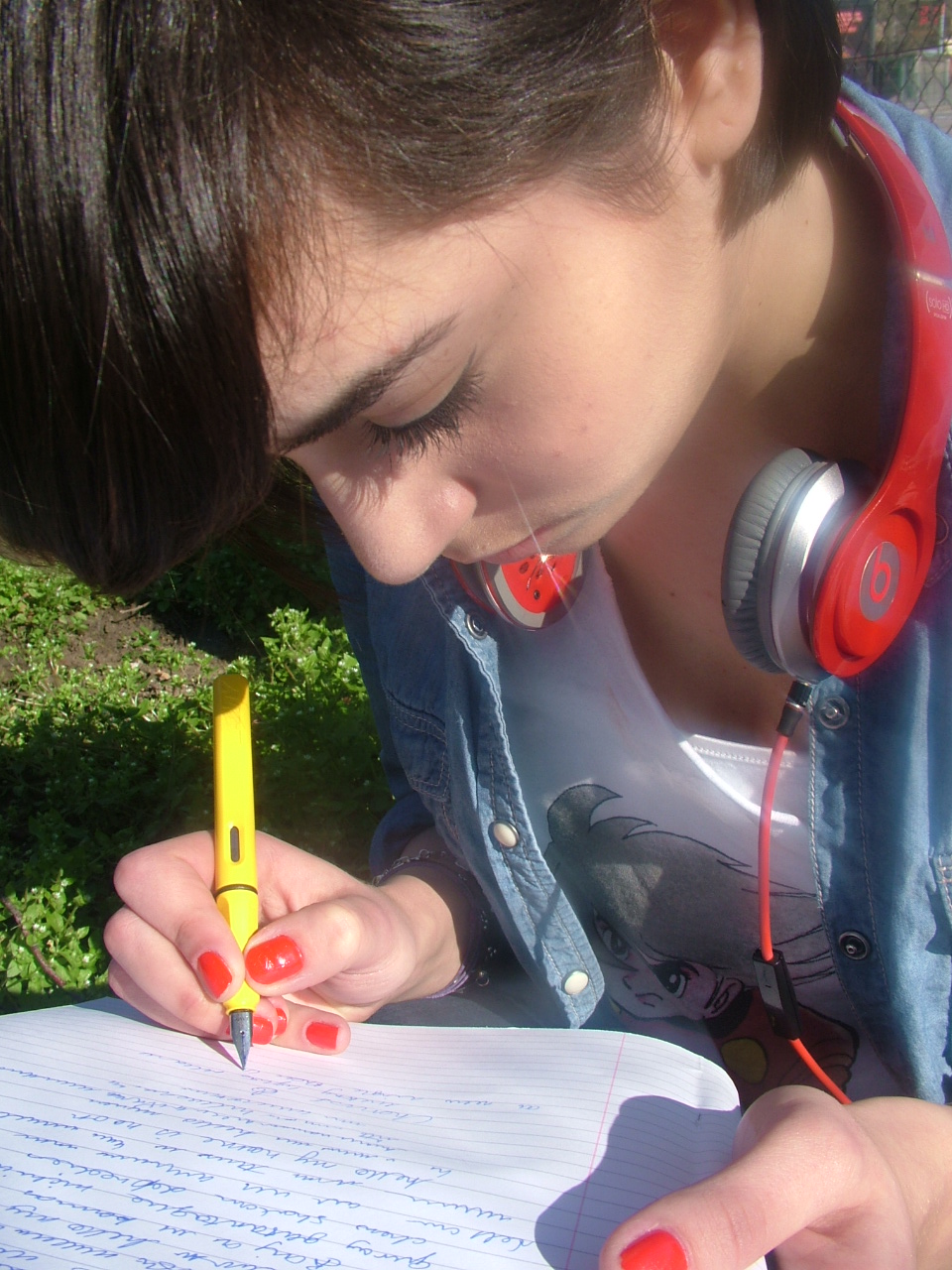
Who would be the audience for your media product?

This is my 'Reader Profile' for my music magazine which lists my audiences interests, character traits and general statistic. In order to reflect that of a professional reader profile such a 'NME' ( as dispayed below) I have tried to make my own one continue the colour scheme illustrated within my entire magazine to exemplify my brand identity as well as making it visually attractive.


Friday, 25 March 2011

AMENDED FINAL COVER
 |
| Following my teacher feedback, I returned to my front cover for my magazine and made a few minor changes. |
Saturday, 19 March 2011
Feedback
Kalise you have made excellent progress with all aspects of the foundation production. Your magazine front page needs very little in the way of improvement. I would suggest smooting the cropping of your model's hair on the front page and consider repositioning some of the copy / cover lines. Your contents page is impressive - you just need to do a bit of airbrushing of some of the images.
Friday, 18 March 2011
Thursday, 17 March 2011
Tuesday, 15 March 2011


Monday, 14 March 2011
Rejected images


 |
| Here the model wasnt ready for the photo and seems to be laughing during the shot. |
 |
I was really fond of the image initially, as I liked the composition using the keyboard and the models firm pose and facial expression, however, I decided not to use this in my final magazine as I found that my chosen image was significantly more effective. |

 |
| Within this photo I found that it just didnt look professional enough and after analysing real music magazines, realised that the pose was quite ordinary and deposited no sense of individuality or originality and so this image was dismissed. Furthermore, I found that the model looked too young and her clothing was not appropraiate as well as the act that the detail on her top was not visible. |

 |
| I found that this pose was a bit awkward and wouldnt work very well within my magazine. In addition the keyboard becomes the main focus of the image, in effect, diverting attention from the artist herself. Similarly, her facial expression was slightly dull as if she hadnt been ready for the photograph. |
 |
| I liked this photo as it is quite edgy, which is ultimately the image that I aim to portray however, after some contemplation, I found that it was slightly too provocative, in terms of the artists pose with her hands between her legs and her tense facial expression.-I aimed for a more light-hearted yet fun sense. |
 |
| Here the photograph came out blurry as the model 'producer' was moving during the shot. |

 |
| I found here that a high angle shot did not work very well and together with the adopted pose, would not reflect the professional camera work generally seen in authentic magazines. |
Production Log

Sunday, 13 March 2011
DRAFTS of front cover

 This is another draft of my fron cover, however I believe its slightly too simple and feminine due to the pink shades and subtle colours. In effect, it would have not appealed to both males and females equally, so ultimately this idea was discarded.
 This is another draft of my front page. I think that the yellow text is far too overpowering as it is the dominant colour on the page as opposed to the purple and red text. Similarly, I found that the masthead did not stand out enough as attention was diverted to the bright lettering. Also, I found that the puff, located above the masthead was too simplistic and did not effectively communicate the eccentricity and quirky sense initiated throught the 'pop' genre.
Latest draft of main article -AMMENDED
Following my teachers review of the 1st draft of my article, a few minor flaws within the text were identified, however, I soon ammended these. Below is the most recent and refined draft of my double-page spread magazine article.
At only 18, Persia White has become the nation’s hot new pop sensation. With 9 number 1 singles, this triple-award winning doll-like princess is set to take the world by storm. Here she speaks to CRUSH magazine in an all exclusive interview about her rags to riches transformation, her obsessive fans and that mind-blowing break-up with teenage heart throb Liam Cage.
At only 18, Persia White has become the nation’s hot new pop sensation. With 9 number 1 singles, this triple-award winning doll-like princess is set to take the world by storm. Here she speaks to CRUSH magazine in an all exclusive interview about her rags to riches transformation, her obsessive fans and that mind-blowing break-up with teenage heart throb Liam Cage.
It’s amazing, I’ve never been here before, the people are lovely, and you guys’ accent is totally radical-I love it! I was so shocked to see the stampede of fans waiting outside my hotel, they surrounded the entire building- it was so surreal.
Wow, what loyal fans you have there, any super-crazy ones you’ve met yet ?
Yeah! Some really umm..motivated ones actually. Last month when I was touring Europe this girl managed to sneak into my car and hide under the seat, then while we were driving I felt something stroke my leg, then she just popped out. I was so creeped out! She had my name written all over her body, it was so strange, but I love that I have such dedicated fans.
Dedicated? I’d call it obsessed!
No no, it’s totally cute- except if they got into my house, now that would be a little freaky. I’d then have to call for a restraining order ( Giggles to herself).
How does it feel to have gone from being a nobody to being known worldwide?
Just....indescribable. I used to live in a small town with my mum and little brother- I never knew my dad. (Pause) We didn’t have much, some nights we’d go to bed hungry, it was heart-breaking to see my mum struggle so much (Pauses, wipes away tear). Now, to be able to travel the world doing what I love, spreading my music worldwide, it’s so exciting, every day I pinch myself, I just never thought this type of thing happened to people like..well, like me I guess.
People like you? How do you mean?
Well, I was a bit of a loser to say the least, in school I was always the one who you sat at lunch alone, had no real friends and, yeah, I wasn’t cool-at all! I was never one of the popular kids, I wouldn’t have had the confidence to strut around the school being centre of attention. But I have to say, I'm a lot more secure within myself now-I've really come out of my shell.
So how do you manage to deal with all the paparazzi and demands of being a celebrity?
A celebrity? (shakes her head) I’m still a normal girl, just with bodyguards an lots of security ( Laughs). I’ll definitely not let the fame get to my head like.....like some of the other newcomers out there, I’ll stay humble-I promise! I’m still that nerdy freak deep down.
Like some of the other newcomers out there? Wanna spill the beans?
Spill the what? ( Confused expression)
Spill the beans, basically do you want to give CONTRAST some superstar gossip?
Wow, do you guys actually use that term in the UK, that’s so strange. Oh and about the question......no comment?
Keeping tight-lipped are you. Okay, moving on, so what’s all the male attention like- are you loving it?
Well of course, what 18 year old girl wouldn’t ( winks) but I’m not dating or anything at the moment, I just came out of a relationship with Liam, so I just wanna focus on my music right now, that’s my passion- not boys! (Begins to chuckle)
Oh yes, Liam Cage, hot chap isn’t he? What went wrong there, you two seemed perfect together. You were the fairytale couple.
Hot what? Oh my, I really do need a slang dictionary or something. Does that mean guy? Well if it does erm, things just wasn’t working out, put it this way, his intentions weren’t as genuine as I thought they were-he was just after the money. Oh wait- don’t print that! (laughs awkwardly)
So on a positive note, your debut album is out Monday 14th, what can we expect from it?
Yeah its out soon, it’s called ‘Perfectly Unperfect’, its a combination of some really quirky and cool tracks, really energetic songs to get you in the party mood- wrote most of them myself too. The music video premieres tomorrow actually, it’s full of bright colours, real-life dolls and floating people....be prepared ( Laughs).
Great-we can’t wait! I’m sure your fans will be queuing up days in advance. So finally, you’re also touring next year right?
Yeah, my tour begins in North America next March through ‘till the following year, I’ll be back in London too-I’m buzzing.
The CRUSH team certainly hope that Persia returns with a bang next year. ‘Perfectly Unperfect’ is bound for pop greatness.
1st draft of main article
At only 18, Persia White has become the nation’s hot new pop sensation. With 9 number 1 singles, this triple-award winning doll-like princess is set to take the world by storm. Here she speaks to CONTRAST magazine in an all exclusive interview about her rags to riches transformation, her obsessive fans and that mind-blowing break-up with teenage heart throb Liam Cage.
Persia, welcome to the UK, what do you think of it so far?
It’s amazing, I’ve never been here before, the people are lovely, and you guys’ accent is so fascinating-I love it! I was so shocked to see the stampede of fans waiting outside my hotel, they surrounded the entire building- it was so surreal.
Wow, loyal fans you have there, any super-crazy ones you’ve met yet ?
Yeah! Some really umm..motivated ones actually. Last month when I was touring Europe this girl managed to sneak into my car and hide under the seat, then while were driving I felt something stroke my leg, then she just popped out. I was so creeped out! She had my name written all over her body, it was so strange, but I love that I have such dedicated fans.
Dedicated? I’d call it obsessed!
No, it’s totally cute- except if they got into my house, now that would be freaky. Then I’d have to call for a restraining order. ( Giggles to herself)
How does it feel to have gone from being a nobody to being known worldwide?
Just....indescribable. I used to live in a small town with my mum and little brother- I never knew my dad. (Pause) We didn’t have much, some nights we’d go to bed hungry, it was heart-breaking to see my mum struggle so much. (Pauses, wipes away tear) Now, to be able to travel the world doing what I love, spreading my music worldwide, it’s so exciting, every day I pinch myself, I just never thought this type of thing happened to people like..well, like me I guess.
People like you? How do you mean?
Well, I was a bit of a loser, in school I was always the one who you sat at lunch alone, had no real friends and, yeah, I wasn’t cool-at all! I was never one of the popular kids, I wouldn’t have had the confidence to strut around the school being centre of attention.
So how do you manage to deal with all the paparazzi and demands of being a celebrity?
A celebrity? (shakes her head) I’m still a normal girl, just with bodyguards an lots of security ( Laughs). I’ll definitely not let the fame get to my head like.....like some of the other newcomers out there, I’ll stay humble-I promise! I’m still that nerdy freak deep down.
Like some of the other newcomers out there? Wanna spill the beans?
Spill the what? ( Confused expression)
Spill the beans, basically do you want to give CONTRAST some superstar gossip?
Wow, do you guys actually use that term in the UK, that’s so strange. Oh and about the question......no comment?
Keeping tight-lipped are you. Okay, moving on, so what’s all the male attention like- are you loving it?
Well of course, what 18 year old girl wouldn’t ( winks) but I’m not dating or anything at the moment, I just came out of a relationship with Liam, so I just wanna focus on my music right now, that’s my passion- not boys! (Begins to chuckle)
Oh yes, Liam Cage, hot chap isn’t he? What went wrong there, you two seem perfect together-fairytale couple you were.
Hot what? Oh my, I really do need a slang dictionary or something. Does that mean guy? Well if it does erm, things just wasn’t working out, put it this way, his intentions weren’t as genuine as I thought they were-he was just after the money. Oh wait- don’t print that! (laughs awkwardly)
So on a positive note, your debut album is out Monday 14th, what can we expect from it?
Yeah its out soon, it’s called ‘Perfectly Unperfect’, its a combination of some really quirky and cool tracks, really energetic songs to get you in the party mood. The music video premieres tomorrow actually, it’s full of bright colours, real-life dolls and floating people....Be prepared( Laughs)
Great-we can’t wait! I’m sure you’re fans will be queuing up days in advance. So finally, you’re also touring next year right?
Yeah, my tour begins in North America next March through ‘till the following year, I’ll be back in London too-I’m buzzing! Thank you so much for having me.
Production Log
At the moment, I am in the process of searching for models to represent my 'other artists' for my contents page. In addition, I have almost completed my front cover and I believe I am on track for the 18/03/11 deadline, however I may need to make a few minor adjustments to refine the overall.
Sunday, 27 February 2011
Feedback
Kalise you are largely up to date with the research and planning work - well done. You have a few things still oustanding i.e. preliminary task contents page and analysis of your audience research.
Tuesday, 15 February 2011
Brief Plans For My Magazine

Front Cover : From looking at several pop music magazine covers I have found that mid-shots work very well for front covers as opposed to long shots which generally make the page appear too spacious and empty.
So I intend to use a mid-shot photograph.
 I also plan to write large numbers on the page, as seen in most magazines, ( see image to the left)
I would like to use bright colours such as yellow and fushcia pinks as they are instantly eye-catching and reflect the pop theme significantly better than pale blues and browns for example.

 Contents Page: I would like to use a range of camera shots on this page ( mid-shots, close-ups, long shots) Incorporating roughly around 3 images onto the page. I may also display an image of the front cover inside too. Furthermore, I will pursue the colour theme of the magazine established on the front cover.
Double Page Spread: I will have about 2-3 images of my main artist, using two different colours anf font style to differentiate the interviewers questions and the artists responses, perhaps blue and orange or orange and black, in order to appeal to males and females.
Monday, 14 February 2011
Friday, 11 February 2011
Idea For Contents Page - Sketch

Here I have drawn a quick sketch which outlines the various elements which my contents page will include.
The different sub-headings will categorise the range of information provided, it will be separated into specific sectioned divisions such as 'style' and 'gossip' ultimately, this will create an ease of reference. The contents will be listed with page numbers to indicate its location within the magazine. I will adopt the use of vivid colours such as yellow, blue and fushcia pink, as they convey a fun and vibrant sense, reflecting the light-hearted attitude of teenage girls. Furthermore, this page will also have a main image of my chosen artist along the right hand side, this would be a long-shot. There will also be additional images corresponding to the topics addressed within the magazine, these images however will be significantly smaller in order for the artist on the front cover to be the focal point. In addition, the composition will be quite compact inn order for it to appear that the magazine is full of content, ultimately making the page seem quite 'alive'. Also, the title will be similar to the color scheme and style of text of the main-heading on the front cover. Moreover, there will also be a section at the bottom, dedicated entirely to the issues displayed on the front cover. This makes it easier to locate the information they were initially captivated by at first glance, as it has been sectioned off from the other topics; there will also be an image of the front cover beside it.
Idea For Double Page Spread - Sketch

For my double page spread on my chosen artist i would have her name in large letters as the title, with a sub-heading employed to introduce the act. Similarly, I would have an introduction for my article for my article which will provide readers with an insight as to the topic which the text will be based around. Furthermore, I plan to include superlatives to over emphasise the artists superiority; hyperboles to exaggerate her success and cliche phrases in order for readers to be able to easily identify the point being made..In addition, the copy will include some questions which will allow the artist to expand upon a subject, ultimately provoking a more detailed response. The use of floating quotes will also be adopted with the intention that it would instantly draw attention and prompt readers to read the article if the quote is dramatic and interesting. Simultaneously, I will also employ colloquialisms in order to craft a sense of realism and also for readers to feel as though they can relate to the text. Similarly, it will also make the interview seem more light-hearted and so would be ideal for my teenage target audience. I will use quite a specific register as while using predominantly formal language, I will intergrate several slang terms in order to reinforce quite a casual, friendly conversation as opposed to a serious, interrogation-like interview. Moreover, I plan to incorporate one main image which will be a long shot of the artist in the centre of the page, as displayed in the photograph above, with the text shaped around it. Also, I will have 1/2 additional images, perhaps 1 location shot and 1 normal shot. Finally, my ideas surrounding the typography is to have a hand-written somewhat girly styled text, with the interviewers questions a different colour to the artists response to exemplify a clear differentiation between the two, in essence, making it easier to read.
2nd Idea For Front Cover - Sketch

This is a second sketch of a proposed front cover idea. I will now briefly outline the main aspects in which the cover would have.
-Additional cover lines.
-Slogan/Puff----- ''My Monthly Music CRUSH''
-Layout slightly more spread out to allow for readers to acknowledge the location shot in the background.
-The artists tilted head and big smile conveys a friendly attitude, she is also somewhat using her hand to hide part of her face, perhaps indicating a shy and innocent sense.This would also be reinforced with her looking up at the camera in a high-angle shot. She will also be wearing eccentric make-up and quirky and somewhat edgy clothing which intentionally contrast the subtle and introvert sense initiated within her pose.
-Background would be of her hometown in order to accentuate her humble origins.
-Additional images.
-Website advertised in order to encourage readers to explore their brand.
1st Idea For Front Cover - Sketch

Brief outline of ideas:
-Image of artist would be placed in front of the mast head.
-A tie-in will be placed at the top right hand corner in order to entice readers to buy the magazine following the offer highlighted.
-The barcode will also be displayed to convey sense of authenticity.
-Additional cover lines.
-Additional images.
-Main cover line will partially over lay the image of the artist and it will be bold and much larger than the rest of the text in order for it to instantly draw attention.
-The mast head 'CRUSH'will be tightly composed to reflect the literal meaning of the word, however it will contain small hearts within the letters, however, the transparency of these symbols will be manipulated in order for it to be more subtle. The hearts will illustrate the colloquial term'crush' and will also echo this as a regular notion obtained by teenage girls.
-The main image will be the focal point of the magazine. The artist will adopt typical features of mise-en-scene for a pop magazine, such as, vibrant make-up with brightly coloured lipstick in order to reinforce a 'doll-like' sense.
-Eccentric coloured clothing will be worn to exemplify the fun and flirtyness of the pop genre.
-Accessories worn to illuminate a sense of femininity, for example a flower in the hair and heart-shaped necklace.
-A slightly low-angle shot used to indicate slight superiority.
-The key words within the headings will be made larger for emphasis.
-Varied size of text.
Composition quite complex/compact in order for it to look more exciting and full of content.
-Ultimately, pop will be depicted as a 'cute', 'fun' & 'quirky' genre.
Tuesday, 8 February 2011
Feedback
Kalise you have provided some detailed and intelligent textual analysis - well done.
Target: work your way through the checklist to ensure that you meet the deadline for the tasks set by 18th Feb.
Target: work your way through the checklist to ensure that you meet the deadline for the tasks set by 18th Feb.
Wednesday, 2 February 2011
Sunday, 30 January 2011
Function & Audience
The predominant functions for music magazines are to inform, entertain, persuade, promote and gratify their audience, however each of these sectors harbour several different strategies adopted by companies enabling them to appeal to their audiences and engage their interest. In order to inform the readers, music magazines can intergrate quotes which they will embed into either a detailed prose or a simplistic Q & A structure. Detailed prose is usually employed to capture more sophisticated audiences whereas Q & A is generally adopted in magazines of which appeal to a younger audience for example pop and R 'n B, in essence this structure is significantly easier to understand due to its direct simplicity. They also inform audiences of what exactly they should expect from specific albums, informing them of general information such as the tracks they consist of. Furthermore, music magazines are also designed to entertain; the use of superlatives which express a superior quality, hyperboles which exaggerate situations making them seem much more dramatic and interesting, colloqualism which makes readers feel as though they can relate to the text, humour which generates a light-hearted sense, celebrity interviews and also gossip factors which is clearly an aspect which absorbs most readers. In addition, music magazines are also manipulated to promote things and persuade their audience to buy artists albums/singles, the implementation of linguistic techniques such as direct address where lexical choices such as ''YOU'' are used regularly and emotive language, collectively help to reinforce ideas ultimately generating sympathy, perhaps altering readers perceptions of artists. Similarly, the frequent advertisements also promote artists albums, fragrances, concerts, etc... Moreover, music magazines also aim to gratify their audience, as they believe that readers gain somewhat of a sense of pleasure from reading magazines.
Thursday, 27 January 2011
Brief Description Of My Initial Ideas For Magazine
I have decided to work independently to produce my music magazine and have come to the conclusion that I will use a solo artist on my front cover. Furthermore, after considering a range of factors I have chosen to do pop music as my genre due to the fact that it is quite broad and so allows for great creativity. Additionally, my target audience will predominantly be teenage girls within the age bracket of 12-17 as is will feature fashion columns, celebrity gossip and teen sensation posters in which I believe would automatically appeal to them. Moreover, the issues within the magazine would be of interest to my specific target audience, for example, celebrity style tips and hot new releases. My influences have been obtained from other music magazines such as 'SmashHits' and 'Top Of The Pops', which both support the conventions surrounding the pop genre. Simultaneously, the colour scheme in which I plan to adopt will consist of colours such as orange, blue and fuchsia pink in order to reflect the fun and vibrancy of the pop theme.I will also craft my magazine using bold contrasting colours and text in order to instantly grasp attention. Similarly, I aim to make my magazine stand out and appeal to my target audience by using a young female artist in which teenage girls could somewhat relate to and also have the appeal which young boys would find attractive..
Double Page Spread Analysis - NME

This double page spread has been extracted from NME magazine.
-The text adopts the use of standard english and is written in the form of continuous prose embedding quotes throughout, I believe that this has been done in order to appeal to more a sophisticated audience. Similiarly this technique is quite typical of an indie/rock magazine as opposed to R & B magazine in which generally implement the simple Q & A approach.
-Intertextuality has also been employed in the title 'Art Of Darkness', which has been drawn from Joseph Conrads ' Heart Of Darkness', perhaps this was incorporated so that readers are able to relate to the subject matter.
-Furthermore, the colour scheme of dark colours such as black, directly reflect the theme initiated through the title.
-The sub-heading provides readers with an immediate insight as to what issues the copy will predominantly focus on.
-The main image is largely engaging due to their lack of posing and eye-contact, ultimately this alludes to the idea that they are quite introvert,niche and humble, this idea is reinforced through the text where they exclaim that they ''did not think they were a big enough band to be on the front cover of NME''.
-The artists facial expressions are quite serious and rigid, instantly illuminating quite an enigmatic sense, this, in addtion to the lack of colour throughout their clothing somewhat reflects their music style as quite simple and straightforward and so would appeal to more sophisticated audiences as they do not need all the frills and excess complexity to be engaged by their sound.
-Moreover, the fact that she is standing in the centre depicts the idea that she is protected by the males in which surround her. Alternatively, I believe that this woman somewhat subverts the notion of vunerability as she is standing slighly in front of the two men with her hands behind her back, automatically conveying a sense of power and dominance in the group.
Wednesday, 26 January 2011
NME- Double Page Spread Analysis (Lilly Allen)

This article is from NME magazine.
A large image of the artists has been placed on one page, automatically bringing it into focus. Lilly Allen is wearing heavy dark make-up, complimented by a jet-black funky hairstyle enhancing the punk/rock culture. Similarly, mise-en-scene has cleverly been manipulated to depict a more edgy image which lacks femininity, and also initiates rebellious traits. She is wearing limited jewellery and a casual plaid shirt which is not fitted an so intentionally does not accentuate her assets, which would usually be a style adopted by young girls to appear sensual and provocative. I believe that this has intentionally been done to portray her simplicity which is then reinforced through the floating quotes as she implies that she is not an attention seeker, she is simply ''just honest''; this direct and blunt attitude corresponds with the attitude conveyed by her style and posture. It is interesting to note that although she claims to not be an attention seeker, her 'goth/punk' appearance is generally adopted by individualistic people who aim not to conform to social norms, therefore wanting to stand out from the crowd, ultimately contradicting her statement. This floating quote has been enlarged and so instantly draws readers into the context of the article, providing them with an immediate insight as to what the article will be about. Moreover, the form of the text communicates an ambiguous yet mysterious sense as it is similar to that of newspaper clippings stereotypically used by criminals,instanly alluding to the idea that the artist is slightly odd in her approach to situations. Furthermore, I think that the article is aimed at readers within the age bracket of 17-24.
Contents Page Analysis - NME

-The main image located at the centre of the page is the focal point and links directly to the main article.
-The colour use is eccentric and vivid indicating a non-uniformed colour scheme, ultimately communicating a light-hearted sense.
-This magazine is evidently directed at a younger audience, perhaps within the age bracket of 17-21.
-In addition, the images are composed in a similar way to how a collage would be crafted, generating the idea that the magazine is quite spontaneous and haphazard as opposed to displaying a fixated structure.
-Each box to the right is of a different color, suggesting individuality for each section.
-Furthermore, the sub-headings are employed to categorise and to create an ease of reference for readers, as well as the page numbers.
-Also, the tie-in for a subscription package at the bottom of the page is enticing as readers are drawn to the idea of an offer.
-This contents page consists of many images making it look excedingly busy and alive, depositing a sense of vibrance and energy.
-I believe that loads of pictures have been placed on this page in order for it to appear that there is a lot to read within the magazine, in essence, exaggerating its content.
Contents Page Analysis - VIBE
 This contents page is extremely minimalistic, perhaps to place more emphasis upon the background image.
- The black and white theme relates to the black and white image of the artist on the front cover, therefore pursuing the colour scheme.
- Additionally. there are very few sub-headings implememented in order to categorise and create an ease of reference for the readers.
- There is limited text deposited over only a small section of the page, perhaps this is done because the type of readers in which this magazaine would attract, do not want fancy lettering and a crowded page, they'd simply prefer to have a more direct and succinct link to specific pages.
- Furthermore, the posture of the central figure is evidently relaxed, laid back and clearly very serious, ultimately indicating a sense of importance and dominance.
- Similiarly, the cheain in which he is wearng supports the rap genre as it communicates the idea of wealth.
- Readers immediately get the impression that this magazine has more of a serious yet casual approach as opposed to magazines such as SmashHits and NME.

Subscribe to:
Comments (Atom)